COLOR PHSYCOLOGY IN DESIGN
Jan 12th, 2023
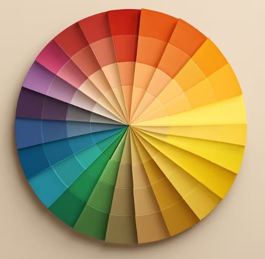
When some people want to lift their spirits, they reach for a bowl of ice cream. There's a better way to improve your mood, though: color. Color is a powerful design tool that can make the rooms in your home feel more calm, cheerful, comfortable or dramatic. Color makes a tiny room feel larger, or a spacious one feel more intimate, without the time and expense of actually moving walls. When doing a remodel project, the goal is to make an old space feel new. We have a fresh slate, an open canvas…so how do you want to use it? Take some time to read about the impact color has in our lives and how we can take advantage of that in our homes.
Red
As one of the most powerful shades in color psychology, red entices a wide range of emotions such as passion, excitement, and ambition. It’s ability to trigger energy makes it an ideal option for creative spaces like home offices and studios. Red has also been known to increase appetite – hence why it’s used in so many restaurants – making it a great choice for kitchen and dining areas.
Orange
Orange is known to invoke fun, energetic enthusiasm in color psychology. Because of its bright and punchy vibrance, orange increases energy levels and boosts creativity. Studies show that the color orange can actually stimulate physical effects such as a heightened sense of activity, increased socialization, increased oxygen supply to the brain, and increased feelings of joy.
Yellow
As one of the most vibrant and joyful colors, sunshiney yellow is related to happiness and optimism. Although it’s the universal color for happiness, yellow is not considered to be a relaxing color because of its brightness. Much like red and orange, yellow is another stimulatory color that increases energy levels, making it ideal for high-traffic areas of your home like the kitchen or living room..

Green
Green stimulates feelings of balance, growth and restoration. Because of its relationship to nature, green offers an organic element that can breathe life into even the most industrial and urban spaces. All shades of green create an atmosphere of serenity and balance, but different hues create different moods and feelings. Deep shades like emerald or forest green can add intensity and elegance to a space, making it great for master bedrooms, dens, and home offices. Lighter hues of green like sage, mint, and jade are more tranquil and can boost focus.

Blue
The peaceful, serene feeling that washes over you when you watch ocean waves roll in and out are linked to the calming effects of the color blue. Blue is associated with feelings of tranquility and neutrality. Ideal for bathroom, bedrooms, and communal living areas, blue can be used anywhere you need a touch of relaxation. Deeper hues like navy or royal blue add a more masculine feeling, while lighter hues like sky or turquoise connote femininity.
Purple
As a color that can develop feelings of creativity, depth, and inspiration, purple works well in studios, home offices, craft rooms, and artistic spaces. Because of its historic association with royalty, in darker hues, purple can make spaces feel more luxurious and sophisticated. Deep plums and wine shades add sensuality and mystery to a room, making it ideal for bedrooms, dens, and vanity spaces. Try out lavenders and lighter purple hues to create softness and playfulness in spaces like children’s rooms, playrooms, and the kitchen.
White
Denoting feelings of purity, cleanliness and innocence, white is by far the most versatile color to use in interior design. Minimalism experienced somewhat of a renaissance in the past decade, making clean white furniture, walls, and fixtures more popular than ever. While many people view white as refreshing and modern, some feel that it’s too sterile and cold. To avoid this issue, integrate pops of color throughout your home to create dimension and warmth.

Black
Although it’s often associated with darkness in pop culture, in color psychology, black signifies power, mystery, depth, and drama. The neutral aspect of black gives it the versatility to work in any space, while offering stability and sleekness. Black is a great option for furniture, hardware, accents, and even wall colors when executed correctly.
Color Psychology Information Credit: Nativainteriors.com


